Aulyr
SOCIAL MEDIA CREATIVE DIRECTION
Details
I built the brand identity for Bloc Abode, a minimalist interior company, around a single constraint, less is more, applied literally. That's easy to say and hard to execute, most "minimal" brands quietly compensate with a bold typeface or an accent colour to make sure they still stand out. I didn't want that safety net. The brief was to build something that could hold attention through restraint alone, with every typography, colour and layout decision having to justify its place or get cut.
Services
Brand Identity
Print & Digital Collateral
Year
2023
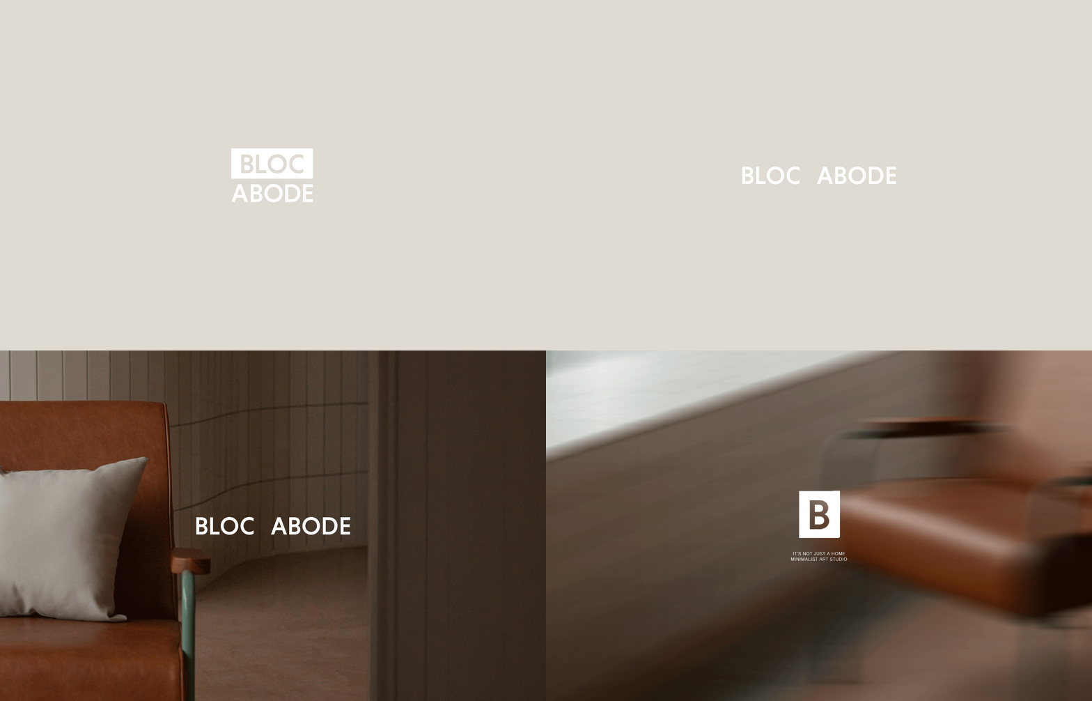
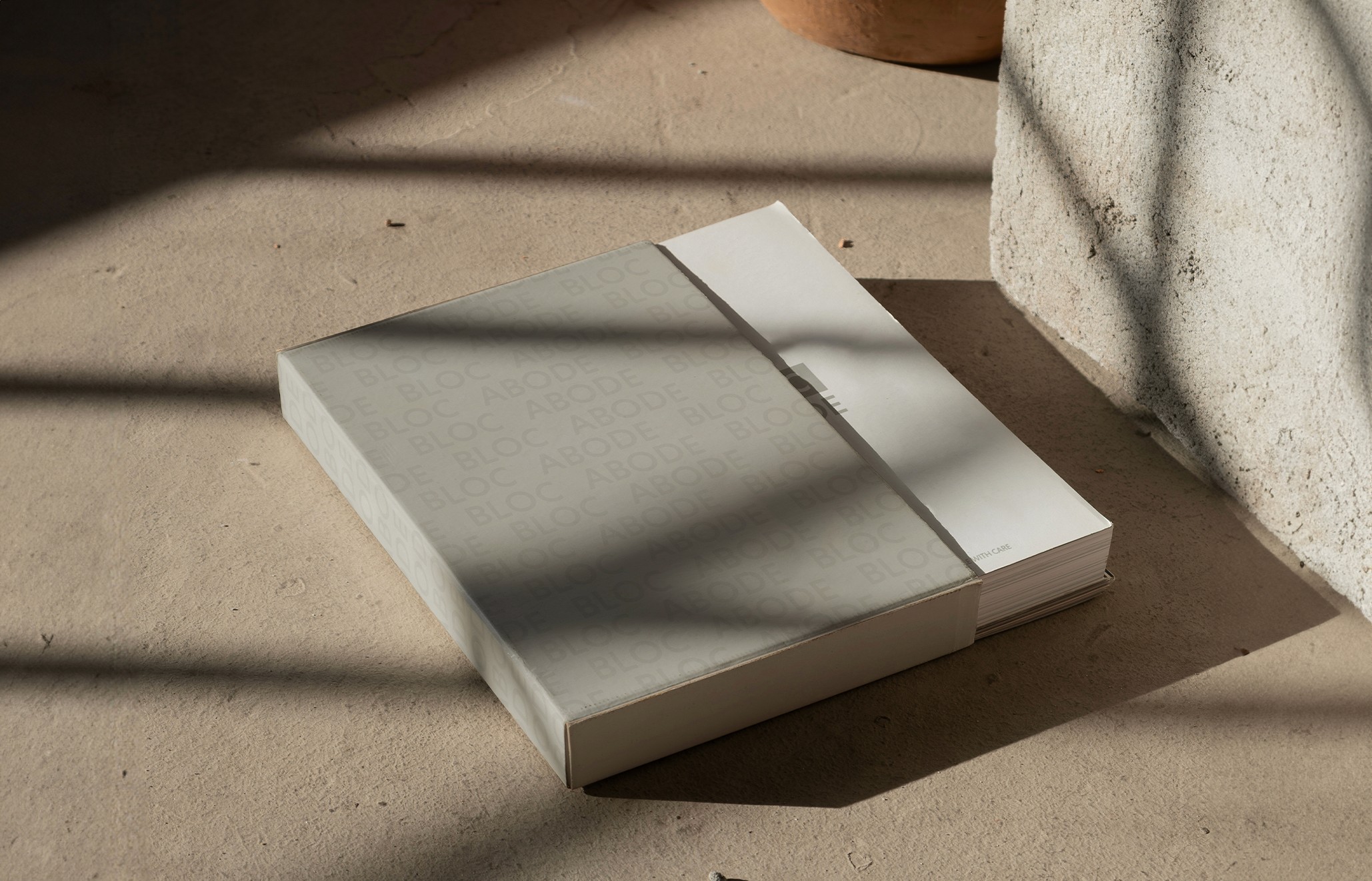
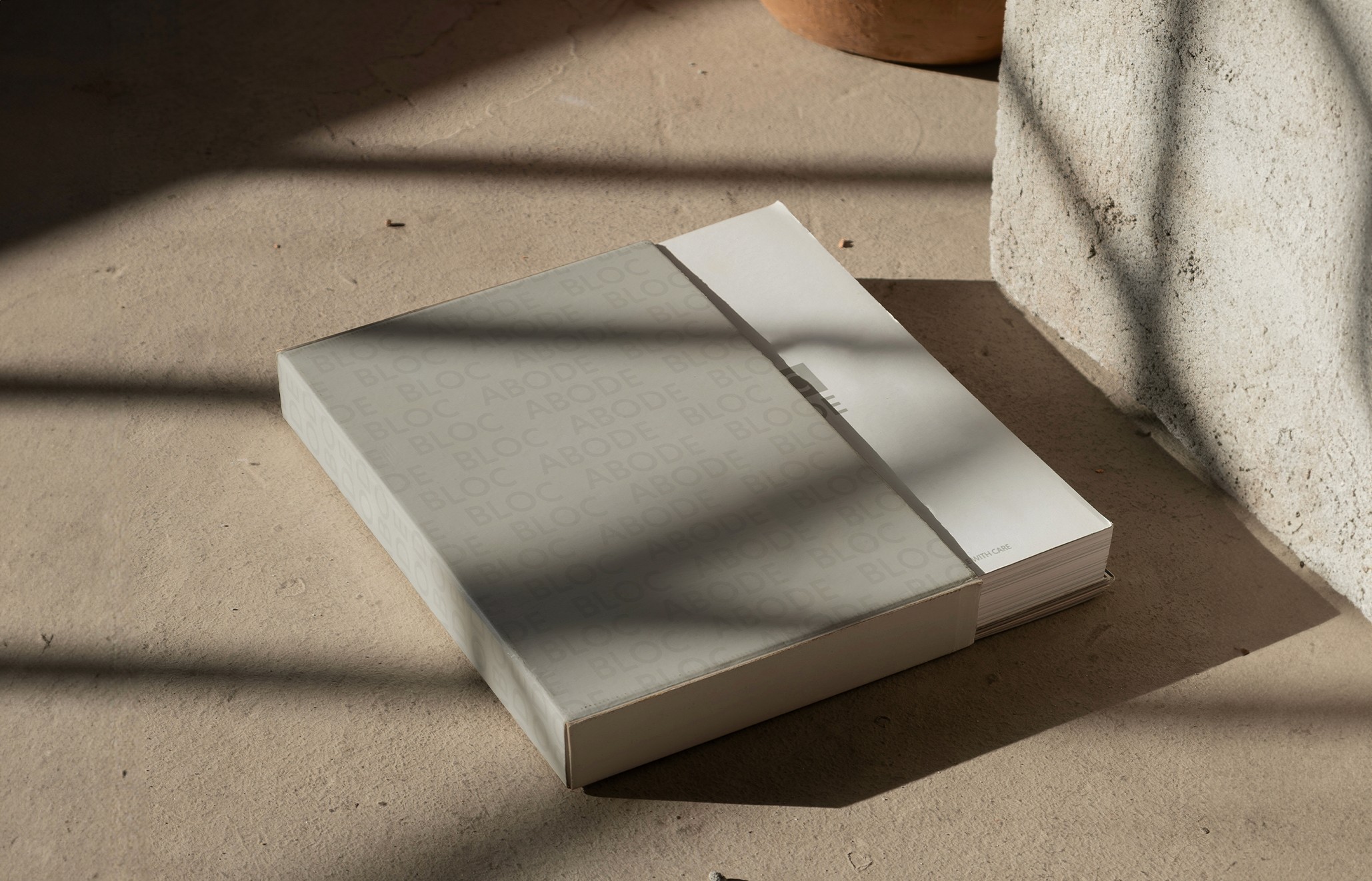
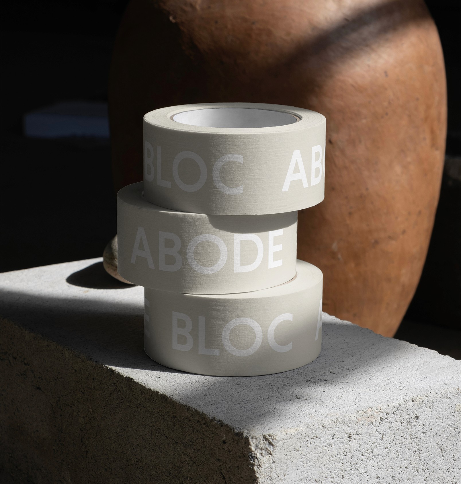
I started with the typography and colour palette, keeping both deliberately narrow. Muted tones, a lot of restraint, nothing competing with the artwork itself. From there I built out a full system across print and digital so the brand held together consistently wherever it showed up.
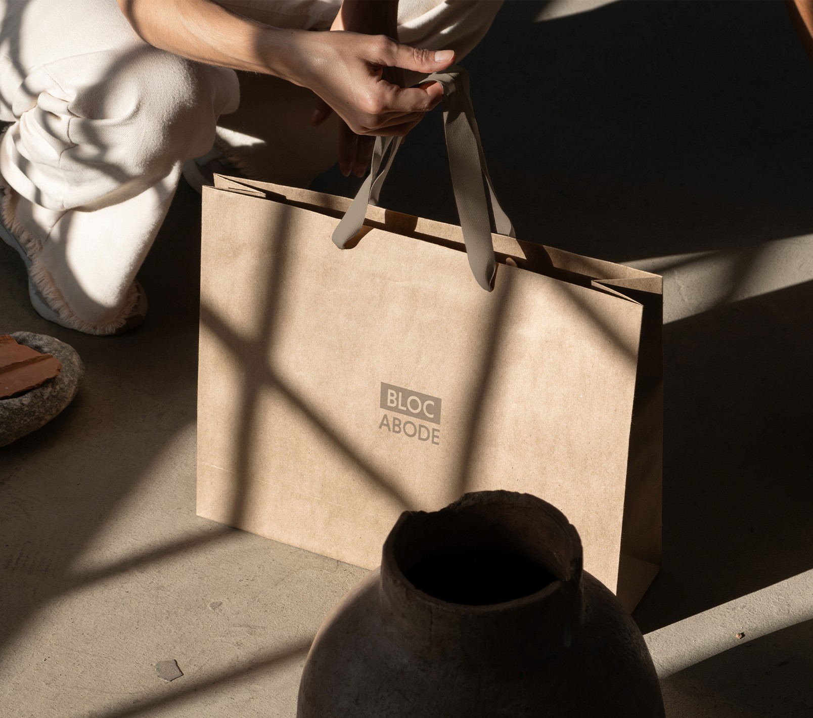
For packaging, I used subtle texture and quiet colour rather than any obvious signalling of quality, the material itself was doing the work, not decoration. For social, I designed layouts with generous spacing so the artwork stayed the focus and the brand framework stayed in the background, supporting rather than competing.
The result is a system that holds its restraint under pressure, it doesn't reach for anything extra even where a louder brand might.